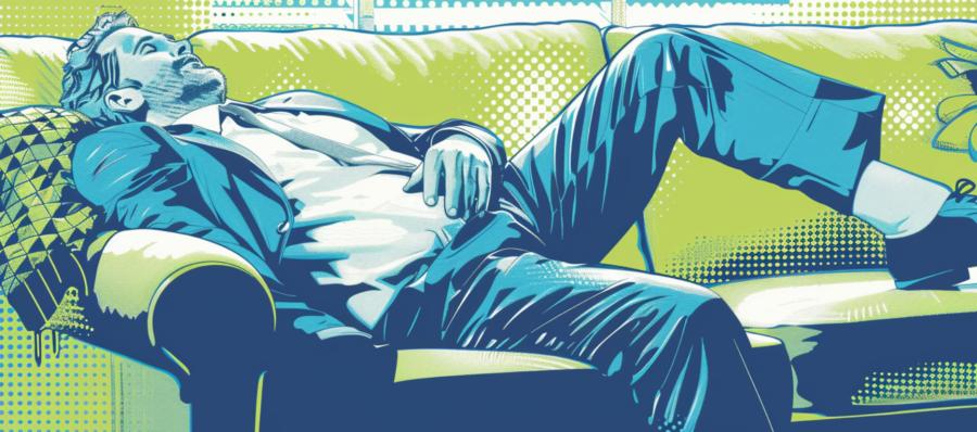
Texture in product photography is not simply about recording detail. Cameras already do that remarkably well. The real challenge lies in persuading the viewer that an object has physical presence. A successful image does more than display a product. It creates the urge to reach out and touch it, even though the screen stubbornly refuses to cooperate.
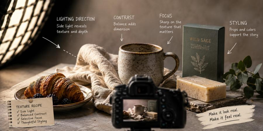
This sense of tangibility comes from several elements working together: lighting direction, contrast, focus, and styling. Each plays a role in translating physical surfaces into visual information the brain can understand and trust.
Why Texture Matters More Than People Realise
Texture carries emotional weight.A soft wool blanket communicates comfort before anyone reads a description. Matte packaging can suggest refinement and restraint, while glossy surfaces often signal energy or luxury. Crusty bread, smooth chocolate, weathered leather, and brushed metal all speak through texture first and product specifications second.
Human perception depends heavily on visual clues linked to touch. When viewers see believable surface detail, the brain begins filling in the missing physical experience.
That reaction matters commercially as well. Online shoppers cannot pick up products, test materials, or inspect finishes. Photography becomes their fingertips.
When texture is missing or poorly represented, trust weakens. Products appear flat, artificial, or oddly disconnected from reality.
Lighting Direction Creates Surface Life
Front lighting often receives praise for being clean and safe. Safe is wonderful for bicycle helmets and password storage. For texture, it can be deeply unhelpful.Light hitting a product directly from the front tends to flatten surfaces. Shadows disappear, tiny elevations become invisible, and materials lose character. Fabric fibres merge together. Embossed packaging stops looking embossed. Handmade details retreat into hiding like nervous guests at a crowded party.
Side lighting changes everything.
When light travels across a surface rather than attacking it head-on, small shadows develop around raised and recessed areas. Those micro-shadows reveal form and dimension.
Serious product photographers often place light at an angle between roughly thirty and ninety degrees to the subject. The precise choice depends on the material itself.
- Fabrics benefit from angled light that reveals weave and softness
- Food often gains richness from directional lighting that enhances surface variation
- Crafted goods such as ceramics or woodwork respond well to light that exposes handmade irregularities
- Packaging with embossed or textured finishes becomes more dimensional under lateral light
Contrast Shapes What the Eye Feels
Contrast often gets discussed as a purely technical setting. In reality, it affects emotional interpretation.Low contrast can create softness and subtlety. High contrast introduces energy and edge. Neither is automatically superior.
Texture depends on balance.
Too little contrast and products appear muted or foggy. Surface details become hesitant and indistinct. Too much contrast, however, can create harsh transitions that overwhelm delicate materials and distort natural appearance.
This becomes particularly important with food and handmade products.
Fresh pastry should display gentle variation rather than aggressive shadow trenches. Handmade soaps or paper goods need enough contrast to reveal craftsmanship without resembling archaeological discoveries excavated under dramatic floodlights.
Focus Decides Where Texture Lives
Sharpness and focus are related, but they are not identical twins sharing a wardrobe.A technically sharp image can still fail to communicate texture if focus lands in the wrong place. Viewers are naturally drawn toward areas of clarity. Whatever appears most defined becomes the surface they mentally examine.
Selective focus can therefore strengthen tactile appeal.
A shallow depth of field works beautifully when it guides attention toward an important surface detail. The grain of leather, the sugar crystals on confectionery, or the fibres of handmade fabric can become visually magnetic when isolated against softer surroundings.
At the same time, excessive blur creates problems.
Products that rely on craftsmanship or material quality often need broader focus coverage. A handcrafted bowl with only one sharp millimetre may look artistic, but customers also want reassurance that the rest of it exists and has not dissolved into decorative fog.
Focus should support texture rather than compete with it.
Styling Gives Texture Context
Texture rarely succeeds alone.Styling determines how surfaces relate to their surroundings. A product placed against an unsuitable background can lose definition regardless of camera settings or lighting expertise.
Serious product photography treats styling as structural rather than decorative.
Contrast between surfaces helps texture stand out. Smooth packaging placed on rough stone gains visual separation. Rustic baked goods paired with polished acrylic may feel oddly disconnected. Natural materials often benefit from backgrounds that complement rather than overpower their character.
Restraint matters.
Props should support the product instead of auditioning for lead roles. A handcrafted candle surrounded by twelve competing accessories risks becoming an unpaid extra in its own photograph.
Colour also influences tactile perception. Neutral tones can allow material detail to dominate, while carefully chosen colour contrast can heighten depth and surface variation.
Small styling adjustments frequently make substantial differences.
A Rough Finish to a Smooth Subject
Texture is persuasive because it feels honest.People respond to photographs that reveal materials with clarity and integrity. Lighting direction, contrast, focus, and styling are not isolated tricks designed to impress. They are tools that help products appear grounded and physically credible.
A viewer may never touch the fabric, taste the pastry, or hold the crafted object. Yet strong photography can still suggest weight, softness, crispness, warmth, or refinement.
That quiet illusion is where texture earns its value.
The best product images do not merely show surfaces. They invite imagination to finish the job. And if someone suddenly wants to stroke a photograph of a wool blanket or inspect a chocolate bar with suspicious dedication, the camera has done its work remarkably well.
Article kindly provided by gdholland.co.uk