Minimalism in web design isn’t just a look—it’s a strategy. It’s a deliberate choice to remove the digital clutter that distracts, overwhelms, or just plain annoys users. At its best, it makes your site feel calm, intuitive, and even—dare we say—trustworthy.
Why Trust Lives in Empty Space
Trust online is a fragile, jittery thing. Flashing pop-ups, 19 fonts, autoplaying videos, and neon CTA buttons that scream like infomercial hosts? All of these erode it fast. On the other hand, white space (also called “negative space” if you’re feeling broody) makes a site feel open, clean, and—most importantly—under control.Users unconsciously interpret a tidy layout as a signal that someone knows what they’re doing. It’s the digital equivalent of walking into a restaurant where the menus are laminated, the lighting makes sense, and no one is yelling your name while throwing peanuts.
In short, minimal design whispers “we’ve got this” without saying a word.
Clarity is Not Boring (Your Bounce Rate Thinks Otherwise)
Let’s get something straight: minimal doesn’t mean plain or uninspired. It just means getting rid of the junk that doesn’t help people do what they came to do. Every pixel should serve a purpose—or at least know someone who does.Sites bloated with carousels, infinite navigation menus, and 12 competing CTAs are not showcasing creativity; they’re broadcasting indecision. Meanwhile, a lean layout lets your key message come through without having to wrestle with decorative clutter. If users don’t know where to click, they’ll click “back.”
Minimal sites aren’t less effective—they’re just better at staying out of their own way.
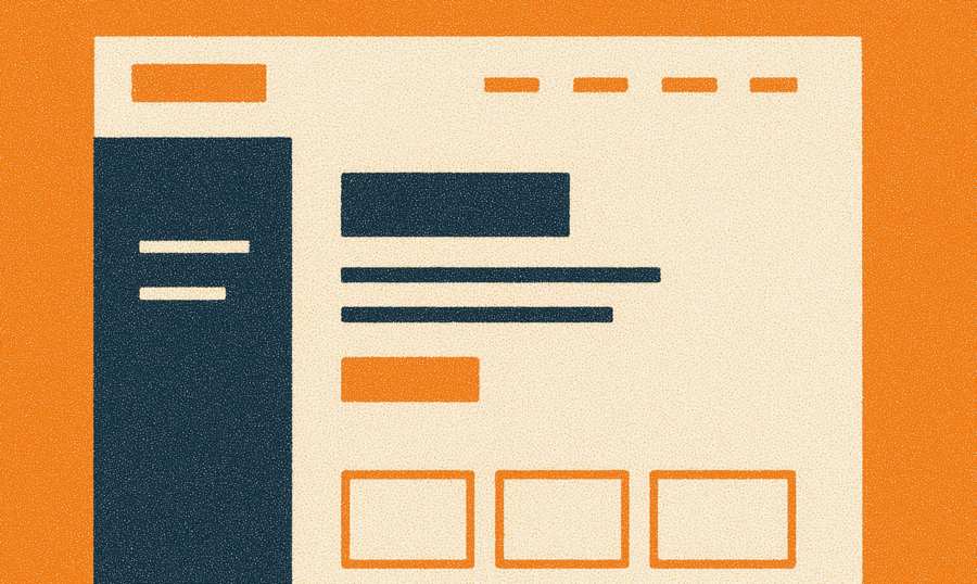
How to Declutter Without Making It Look Like a Design Diet
Ready to cut the fat? Don’t worry—you don’t have to go full monk with nothing but black text on a white background. The goal isn’t visual poverty; it’s thoughtful restraint. Here’s how to streamline without losing personality:- Audit every element – If it doesn’t help the user or the message, it’s got to go. Yes, even that spinning “hot deal” GIF from 2014.
- Limit color palettes – Choose a few strong, consistent colors. Not the whole rainbow. Your website isn’t a unicorn rave.
- Embrace white space – Padding and margins are not wasted space; they’re breathing room for the eyes. Think of them as the digital version of not shouting during small talk.
- Use clear, simple typography – Pick one or two fonts max. And no, Papyrus doesn’t count. Ever.
User Paths Shouldn’t Feel Like a Maze Designed by a Trickster God
Ever landed on a website and instantly felt like you needed a treasure map, a compass, and maybe a small sacrificial offering to find the “Contact” page? That’s what happens when navigation is treated as an afterthought or, worse, a playground for design experiments.A minimal layout makes user paths obvious—no mind games required. People shouldn’t have to hunt down your services, pricing, or that one elusive “Buy Now” button hidden under three dropdowns and a parallax scroll. They’re not here for an Easter egg hunt; they’re here because they need something.
Start by deciding what you actually want visitors to do on your site—buy a product, fill out a form, read an article—and then make that path dead simple to follow. Use contrast and hierarchy to guide attention, not flashing arrows or cartoon mascots waving signs.
Whitespace is a Weapon, Not Wasted Real Estate
Whitespace gets misunderstood more often than a misunderstood villain in a melodrama. It’s not empty. It’s intentional space that frames your content and allows your design to breathe. In fact, some of the most persuasive websites out there are, technically speaking, more space than stuff.Use whitespace to separate elements, highlight key areas, and slow the user’s scroll just enough to focus. It’s not about spreading everything out like butter on toast—it’s about rhythm. Strategic pauses. Letting the eye rest. Not cramming five columns of text into a single fold like you’re afraid of running out of screen.
Give your content room to show off. Even your headline will thank you for not burying it in a crowd of conflicting buttons and widgets.
Less Is Trustworthy
At the core of it all, minimal design says, “We respect your time.” It doesn’t overcompensate. It doesn’t try to distract. It just quietly shows up and does its job, which—when done right—builds credibility fast.Users are more likely to trust and engage with a site that feels structured, deliberate, and free of chaos. That trust translates into lower bounce rates, higher conversions, and fewer angry emails about how your site broke someone’s brain.
Whitespace, Meet Walletspace
Here’s the twist: minimalist design doesn’t just make your site prettier and more trustworthy—it often leads to better results. Fewer distractions mean more focus. More focus means more conversions. More conversions mean you finally stop crying into your analytics reports.So while the maximalist sites are busy spinning and sliding and autoplaying every possible widget into existence, yours can quietly convert, reassure, and perform—without all the noise.
Sometimes the loudest thing you can say is nothing at all.
Article kindly provided by woww.co.za