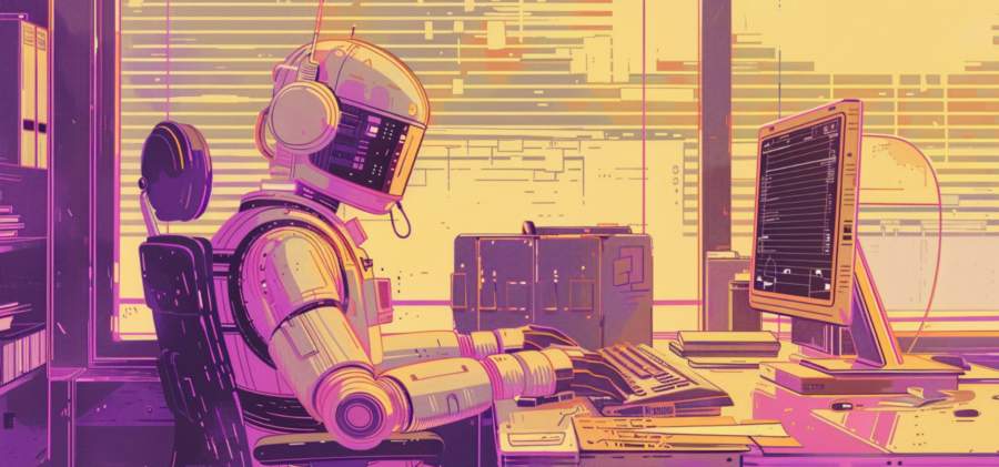
Microanimations: Small Moves, Big Impact
Let’s set one thing straight: microanimations are not the confetti cannons of web design. They’re more like a gentle nudge from your hyper-efficient coworker reminding you to finish your report. They guide users subtly, ensuring they don’t accidentally wander into the “404 error” wilderness.Take navigation menus, for instance. Ever hovered over a menu item and watched it expand just enough to feel welcoming without shouting “LOOK AT ME”? That’s microanimation in action. It’s about making users feel engaged without overwhelming them. It’s like hosting a party and letting your guests explore your home naturally, instead of herding them into the living room like overzealous cattle.
The Unsung Hero of Form Validation
Forms have a long-standing reputation for being the joy vampires of the internet. Enter microanimations to save the day. When you submit a form and a field glows red for an error, that’s not just a scolding—it’s communication. A gentle shake of a form field says, “Hey, buddy, something’s off here,” without making you feel like the worst typist on Earth.Now, designers are taking it a step further. Imagine input fields that gently pulse to guide your eyes to the right spot or checkmarks that appear with a satisfying “pop” once you get something right. It’s the kind of validation we all need—minus the therapy bills.
Accessibility: Movement for All
Microanimations are more than eye candy—they’re an accessibility powerhouse. For users with cognitive or visual impairments, these tiny movements act as cues to navigate interfaces more intuitively. A button that changes color or grows slightly when hovered over is far easier to identify for someone who struggles with fine motor skills or focus.And accessibility isn’t just about doing the “right thing.” It’s about expanding your audience. When your site is welcoming to everyone, you’re not just being nice—you’re also being smart. Because, let’s be real, no one wants to exclude users who might turn into paying customers.
Storytelling with Subtle Motion
Every good story has a flow, and microanimations are the punctuation marks of digital storytelling. They create rhythm and direction, ensuring users follow the narrative path you’ve laid out. Think of a product page: as you scroll, images might fade in gently, drawing your focus, while text slides into place like it’s saying, “Here’s the good stuff.”It’s not just about showing off, either. Storytelling animations help users digest information at the right pace. Too much, too fast, and you’re throwing them into the deep end without a life jacket. With microanimations, it’s more like a leisurely swim where the water temperature is just right.
Take a look at interactive infographics. With each scroll or click, data points animate into view, making complex information feel approachable. It’s like having a charming host explain rocket science, but with far less chance of confusing diagrams.
The Right Touch: Avoiding Animation Overload
Of course, with great motion comes great responsibility. Overloading a site with microanimations is the digital equivalent of using glitter—sure, it’s eye-catching, but it’s also a nightmare to clean up (or, in this case, navigate).The key is subtlety. Microanimations should feel like a natural extension of the interface, not a disco party in the 70s. Remember the principle of usability: if your animation isn’t adding value—whether it’s guiding, informing, or improving accessibility—then it’s probably just noise.
One recent trend is user-triggered animations, where movement only happens as a direct result of interaction. A button may light up, but only when you hover over it. This ensures the motion feels earned, rather than forced upon unsuspecting visitors. No one likes a pushy website, after all.
Moving Forward, One Pixel at a Time
As web design trends march into 2025, microanimations will undoubtedly continue to evolve. They’ll become smarter, more personalized, and even more essential to the user experience. Whether it’s helping users navigate complex interfaces or simply adding a touch of delight, these tiny movements are proving that, in design, the smallest things often make the biggest difference.So, next time you’re crafting a website, take a moment to think about how your buttons, menus, and forms might move. With the right microanimation strategy, you’re not just designing a site—you’re choreographing a user experience that feels alive, engaging, and downright human.
Article kindly provided by worldwideadpollock.com