Why Minimalism? The Clutter-Free Philosophy
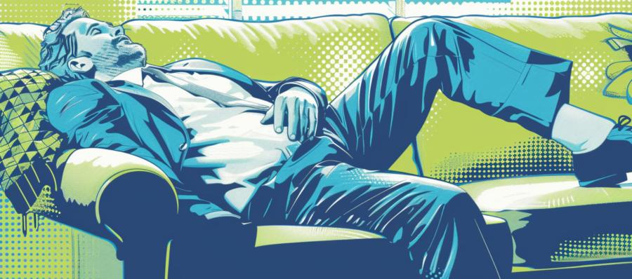
Imagine entering a room where every inch of space is covered with decor, knick-knacks, and furniture. Overwhelming, isn’t it? Now, picture a room with just a few well-placed items. Suddenly, you can breathe! The same principle applies to web design. Minimalism isn’t just an aesthetic choice; it’s a commitment to removing the superfluous and enhancing the user experience. By stripping down designs to the essentials, websites become navigable and comprehensible, making the important content pop without the noise.Aesthetics and Functionality: A Balancing Act
Minimalism does not mean throwing every piece of design out the window. Instead, it’s about achieving the perfect balance between functionality and aesthetics. It’s like a tightrope walker in a circus; every element must be carefully considered and perfectly balanced to ensure a seamless performance. This design approach enhances usability by focusing on core content and functionality, reducing distractions and making the user journey intuitive and fluid.Enhancing Usability with Less
By embracing less, you actually offer more to the user. Fewer elements on a page mean less cognitive load for visitors, allowing them to process and navigate your site more efficiently. This simplicity leads to a better user experience, higher engagement, and increased conversions. Each button, image, and line of text earns its place, ensuring that nothing dilutes the site’s message or functionality.The Power of White Space
White space, often underestimated, is the backbone of minimalism. It’s not merely empty space—it’s a powerful design element. In the realm of web design, white space is used to create a flow that guides the eyes from one element to another, subtly emphasizing the most crucial parts of your site. It’s akin to pausing between sentences in a speech, giving the audience time to digest words, enhancing understanding, and preventing overwhelm.Typography That Speaks Volumes
In a minimalist design, where visuals are not the frontline soldiers, typography becomes a key player. The choice of font and text arrangement can make or break the user interface. A well-selected typeface that complements the overall design can convey your brand’s message with just the right tone, ensuring clarity and harmony on the page. Think of typography as the voice of your website—subtle yet powerful, capable of leaving a lasting impression.Color Minimalism: Less Is Indeed More
In a minimalist design, color is not just an aesthetic choice; it’s a strategic tool. With a limited palette, each color choice must be deliberate and impactful. Selecting just one or two primary colors can enhance brand recognition and create a visually cohesive experience. This isn’t about splashing the brightest shades across the screen, but rather choosing colors that evoke the right emotions and actions from users. It’s about using color sparingly but effectively, like a chef using just enough spice to perfect a dish without overpowering it.Navigational Clarity in Minimalism
One of the greatest benefits of a minimalist web design is the clarity it brings to navigation. Without the clutter of excessive links, buttons, and graphical elements, users can navigate your site intuitively. A clear, concise menu that guides users exactly where they need to go is like a well-lit path through a dark forest. It’s about removing obstacles and making the journey toward the desired action as straightforward as possible.Imagery with Impact
In the context of minimalism, every image must justify its presence on your website. Instead of using multiple mediocre images, a minimalist approach focuses on fewer, high-quality images that are powerful and relevant. These images are used to capture attention and communicate messages more effectively. Like a solitary sculpture in an art gallery, each image stands out, making a significant impact on the viewer.Mobile-First: Minimalism at Its Best
Minimalism meshes perfectly with the mobile-first approach, where screen space is at a premium. By focusing on essential elements, minimalist design ensures that websites function seamlessly on smaller screens, providing a better user experience. This is crucial in a world where mobile browsing predominates. It’s about giving users what they need without the extra fluff, making every tap and swipe count.Bringing It All Together
Adopting minimalism in web design isn’t just about following a trend—it’s about embracing a philosophy that enhances user experience through simplicity, clarity, and intention. This approach isn’t for every website, but for those that do embrace it, the benefits are clear: a clean, efficient, and compelling user interface that speaks volumes without shouting. In a digital world full of noise, a minimalist website is a breath of fresh air, inviting users to enjoy a moment of clarity and focus. As more designers adopt this style, it becomes evident that sometimes, the best way to stand out is by stripping back.Article kindly provided by bitstudios.at


